Website design examples by industry, and what each one gets right

Five websites we built for a law firm, an architect, a watch dealer, a clinic and a hardware shop. What each one does well, and why.

By the Exibify team · Published

Most website design examples online are just pretty screenshots. You see how a site looks. You never find out why it looks that way, or whether it brings in any work. So here are five sites we designed ourselves, with the story behind each one. It’s the same thinking that goes into everything we build.

A London law firm. An architect. A watch dealer in Wales. A skin clinic in Peckham. A hardware shop in Soho. For each one, we’ll show you what the site does well, and the ideas you can borrow for yours.

At a glance

Five businesses. Five problems. Five ideas worth borrowing.

  1. 01Law firmKeep it calm. Make contact easy.
  2. 02Architecture practiceLet the work do the talking.
  3. 03Watch dealerSay less. Show the facts.
  4. 04Aesthetic clinicEvery road leads to a chat.
  5. 05Ironmongery shopSort it the way customers ask.

How to use examples without copying them

Don’t copy the look. Copy the thinking. A watch dealer’s dark, quiet homepage would feel odd for a family plumber. But the idea behind it, showing plain facts so people trust you, works for almost anyone. Treat any sample website or web design sample as a starting point, not a template.

As you look at each example, ask yourself three things. What do I notice first? How do I get in touch or buy? What did they leave out? The answers tell you far more than any colour scheme.

Example 01 · Law firm

Law firm: calm, credible and consultation-led

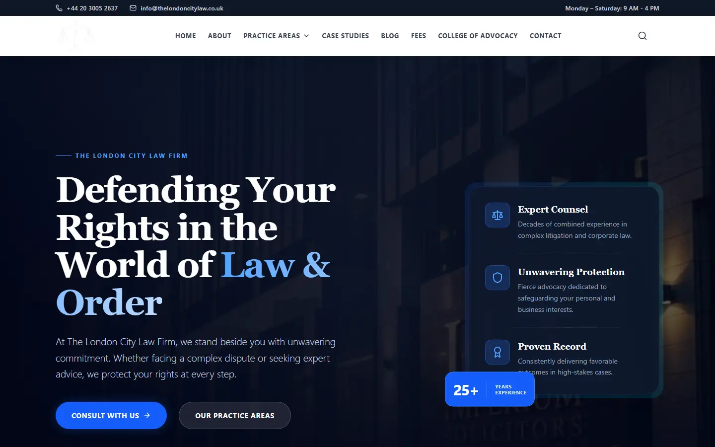
Homepage of The London City Law Firm website, with a formal heading and a single button to book a consultation
The London City Law Firm, designed and built by Exibify

Nobody looks for a solicitor on a good day. They’re worried about a visa, a dispute or a will, and they judge the firm in seconds. A busy, cluttered page feels like a busy firm that won’t have time for them.

So we kept it calm. Big, clear headings. Short paragraphs. Plenty of space. The firm covers six areas of law, and each one has its own page, so someone with a family matter never has to read about immigration. The phone number and opening hours sit at the top of every page. And the first screen asks for just one thing: book a consultation.

What to borrow for your own site

  • Put your phone number where nobody has to hunt for it.
  • Give each service its own page.
  • Ask for one thing on your homepage, not five.
Read the The London City Law Firm case study

Example 02 · Architecture practice

Architecture practice: portfolio and project stories

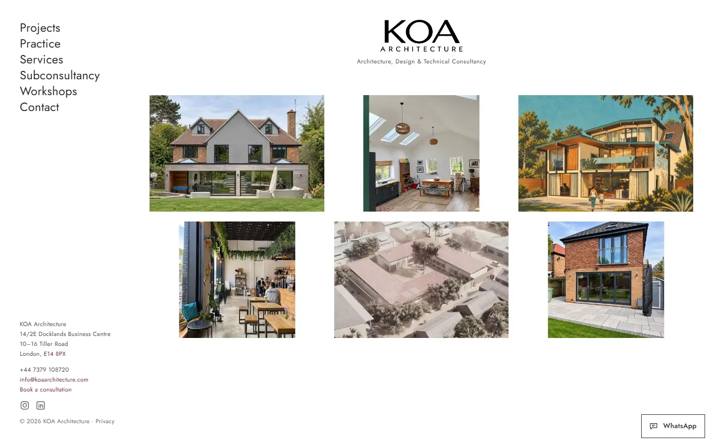
KOA Architecture website showing its projects as large photographs with very little around them
KOA Architecture, designed and built by Exibify

Nobody hires an architect on a promise. They want to see what you’ve built. So on KOA’s site, the projects are the site. Big photos, from family homes to a school in Senegal, with very little around them. The buildings do the talking.

KOA works for two kinds of client: homeowners planning an extension, and other architects who need technical help. Each has its own section, so nobody reads about the wrong thing. And there are two ways to get in touch: a proper consultation form, or a quick WhatsApp message that’s already half written for you.

What to borrow for your own site

  • If your work looks good, make it the biggest thing on the page.
  • Give each type of customer their own way in.
  • Offer a formal way to get in touch, and a quick, casual one.
Read the KOA Architecture case study

Example 03 · Watch dealer

Watch dealer: restraint that signals value

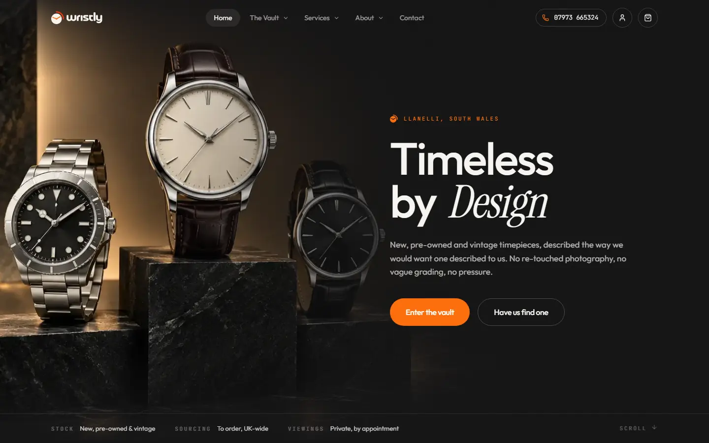
Wristly website with a dark, quiet design and two choices on the homepage: browse the vault or ask the dealer to find a watch
Wristly, designed and built by Exibify

Would you send thousands of pounds to a small watch dealer you found online? Only if you trusted them. Wristly’s site earns that trust by staying quiet. A dark background. Fine lettering. Lots of space. Your eye goes straight to the watches.

Every watch is listed the same way: model number, year, condition and price. Condition is described in plain words, not vague grades. Watches that have sold stay on the site, so you can see what the dealer handles. And the site explains, honestly, how prices are worked out. No hype. Just facts. That’s what makes it feel safe.

What to borrow for your own site

  • Show the same facts, in the same order, every time.
  • Explain how you set your prices.
  • Keep your homepage to the two or three things people came for.
Read the Wristly case study

Example 04 · Aesthetic clinic

Aesthetic clinic: consultation-first booking

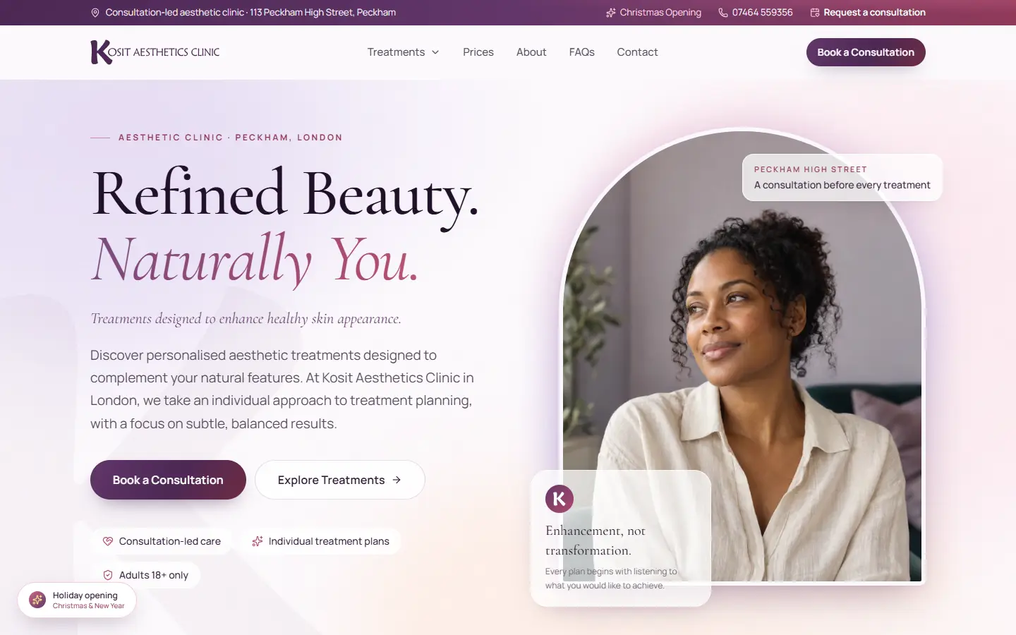
Kosit Aesthetics Clinic website with a soft, simple design and its treatments grouped by type
Kosit Aesthetics Clinic, designed and built by Exibify

Booking a cosmetic treatment is a big decision, and lots of people feel nervous about it. This clinic never books anyone straight in. Everyone starts with a conversation. So the website does the same.

Tap Book on any treatment and you land on a consultation request, with that treatment already filled in. The form tells you plainly what happens next: you suggest a few times, and the clinic gets back to you. Prices are on show. The cancellation rules are easy to find. And the usual worries, like cost and age limits, are answered before anyone has to ask.

What to borrow for your own site

  • Make your booking form match how you really work.
  • Fill in what you already know, so people don’t have to choose twice.
  • Show prices and policies up front. It answers what people feel shy asking.
Read the Kosit Aesthetics Clinic case study

Example 05 · Ironmongery shop

Ironmongery: an online counter for a physical shop

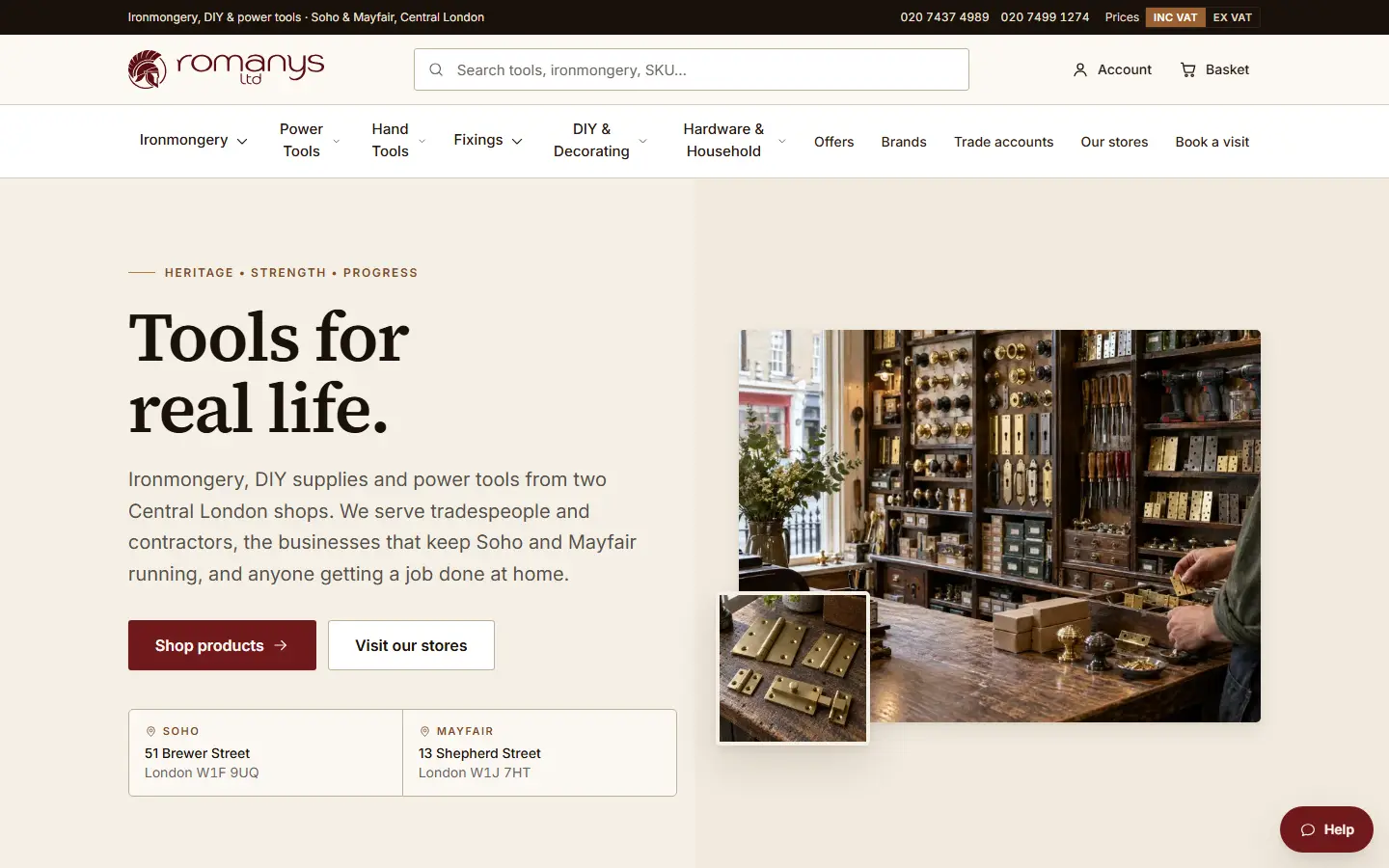
Romanys ironmongery online shop with department menus and a search bar for products, brands and codes
Romanys Ltd, designed and built by Exibify

A builder who walks into a hardware shop doesn’t browse. They know exactly what they need, often down to the product code. So the website works the same way. There’s a search bar on every page, and you can type a product name, a brand or a code.

Romanys sells to tradespeople and homeowners from two shops in Soho and Mayfair, and small touches keep both happy. One switch shows every price with or without VAT. Businesses can open a trade account. Anything without a price leads to a quick quote. And both shops stay front and centre, with delivery or collection at checkout. The website and the counter work as a team.

What to borrow for your own site

  • Let people search with the words they already use, even product codes.
  • If you sell to trade and the public, design for both.
  • If you have a shop, make it part of your website.
Read the Romanys Ltd case study

These are just five of our client projects. You’ll find trades, transport firms, charities and online shops there too, each with the story behind it.

Inspiration sites worth bookmarking, and their limits

An inspiration site is a quick way to see lots of designs in one place. Just know what each one is good for.

Awwwards
Award-winning websites, judged mostly on looks and creativity. Great for ideas. But many winners are built to impress other designers, not to win customers.
Dribbble and Behance
Designers’ portfolios, full of single screens and concepts. Lots of these were never built, or tested on real customers.
Your competitors’ websites
The sites your customers compare you with. Good for spotting gaps. Copy them, though, and you’ll look like everyone else.
Sites you use yourself
The shops and services you buy from. Often the best ideas of all, because you know how they feel to use.

Every gallery has the same blind spot. It shows you the result, never the reason. You can’t tell who the site was for, or whether it worked. That’s why every example in this guide comes with its story.

Turning examples into your own brief

Collecting web design website examples is the easy part. Here’s how to turn them into a brief a designer can actually use.

  1. 1

    Pick three to five sites

    Any more and the message gets muddy. Include one from outside your industry.

  2. 2

    Say why you like each one

    “Easy to book on my phone” helps a designer far more than “looks nice”.

  3. 3

    Name one thing you don’t like

    It rules out whole directions early, which saves time.

  4. 4

    Decide what visitors should do

    Call, book, buy or ask for a quote. The design follows from that.

  5. 5

    List the pages you need

    Services, prices, reviews, booking. That’s the start of your sitemap.

Bring that list to your first call. It speeds up the website design process because the designer starts from your goals, not guesses. Still working out a budget? Our guide to what a website costs in the UK explains what changes the price.

Next step

Found a few sites you love? Let’s turn them into one that works for your business.
Website design example questions

01

What makes a good website design example?

One that solves the same problem you have. Check how quickly it tells you what the business does, how easy it is to get in touch, and how it works on a phone. A plain site that does your job well beats a beautiful one built for something else.

02

Can I copy a website design I like?

Borrow ideas, not designs. Learning from a layout or a booking form is fine. Copying someone’s look, words or photos can land you in copyright trouble, and it makes you look like them. A good designer turns what you like into something that’s clearly yours.

03

Where can I find website design inspiration?

Awwwards, Dribbble and Behance are good for visual ideas. For practical ones, look at your competitors and at the shops and services you use yourself. Agency case studies help too, because they explain why each choice was made.

04

How many example websites should I send my web designer?

Three to five, with a line on what you like about each. Add one you dislike, and say why. That gives a clear direction without pulling the design in too many ways.

05

Do you have sample websites for my industry?

Probably. We’ve built websites for law firms, clinics, architects, trades, shops, transport firms and more. You can browse them by industry on our work page, and each one has a case study explaining what we built and why.

Let's work together!

Send us a few websites you like and tell us what yours needs to do. We’ll come back with a written proposal, and the price agreed before any work starts.

Book a call with
the Exibify team
Book a Call