Case Study · Health & Beauty
A reassuring website for Rosewood Plus home care
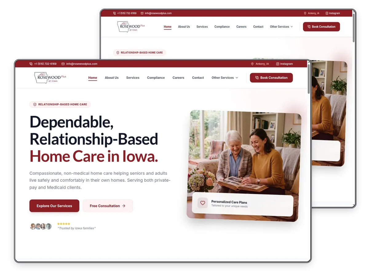
Rosewood Plus provides non-medical home care to seniors and adults from Ankeny, Iowa. We designed and built a website that is calm to read, clear about what is offered and easy for a worried family member to act on.
The Project
About Rosewood Plus Home Care
The agency helps people stay in their own homes with bathing and dressing support, companionship, meal preparation, mobility assistance and medication reminders. It accepts both Medicaid and private-pay clients, uses personalised care plans, assigns consistent caregivers and describes background-checked, trained staff and regular supervisor check-ins. It states that it operates under Iowa Department of Health and Human Services oversight.
- Client
- Rosewood Plus Home Care
- Industry
- Non-medical home care agency
- Location
- Ankeny, Iowa, USA
- Services
- Web Design
- Web Development
- Website
- rosewoodplus.com
The Brief
What the website needed to do
The people reading a home care site are often adult children making a difficult decision quickly, so tone matters as much as layout. The website had to explain exactly what non-medical care means, show that the agency is regulated and screens its staff, and make a free consultation simple to request. It also needed room for recruitment, as caregivers are as important to the agency as clients.
Our Approach
How we designed and built it
- 01
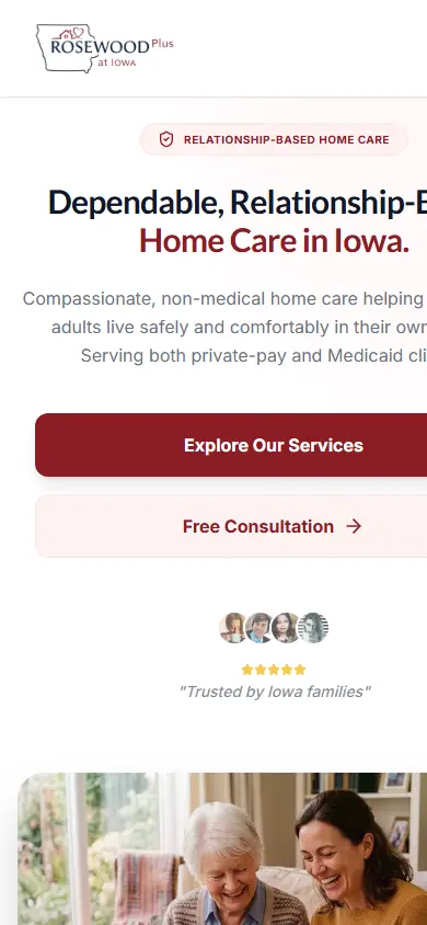
We used soft colours, plain language and large, readable type throughout. The hero states the promise, relationship-based care in Iowa, and offers two routes: explore services or book a free consultation. Reassurance sits directly beneath it in short badges for personalised plans, screened caregivers and local service.
- 02
Each of the six core services has its own card with a short description, and a dedicated page for full detail. A five-step explanation, from first inquiry to a home assessment, care plan and caregiver match, removes uncertainty about what happens next. Compliance and careers have their own pages, so the main journey stays uncluttered.
- 03
Throughout, the build favours legibility over decoration: high contrast, generous line spacing and buttons that are easy to hit on a tablet or phone. Contact details sit in the header, so a family can call without scrolling, and a newsletter sign-up in the footer keeps in touch with those not ready to enquire.
What We Built
Inside the Rosewood Plus Home Care website
The features that do the work, all live on rosewoodplus.com today.
See it live- 01
Six service cards
Bathing, dressing, companionship, meals, mobility and medication reminders are each explained in a short card.
- 02
Free consultation buttons
Book Consultation calls to action in the header and throughout the page lead to the contact route.
- 03
What makes us different
A section on personalised plans, consistent caregivers, round-the-clock availability and supervisor check-ins builds trust.
- 04
Compliance page
Regulatory information has its own place in the main menu so families can verify the agency.
- 05
Careers page
A dedicated route gives caregiver applicants a way in, separate from client enquiries.

Let's work together!
Like what we built for Rosewood Plus Home Care? Tell us about your project and we'll show you how we'd approach it.
 Book a call with
the Exibify teamBook a Call